


PALCO is a creative studio specialized in creating experiences that tell impactful stories.
With an innovative and strategic approach, we help brands stand out, remain relevant, and establish authentic connections with their audiences. Our space hosts a series of initiatives, including Showcase for Brands, dedicated to the activation of emerging brands. We also promote “É Pra Amanhã”, a segment that gives a voice to creative and inspiring people.
BRANDING
IDENTITY CONCEPT:
The logo was developed from the FEDERO font, designed by Alexa Volochay. FEDERO is a formal typeface that conveys confidence, security, and stability. The monogram aims to represent a “J” through perspectives and irregularities that illustrate the building, thus aligning the logo with the project’s typology.
COLOR:
Colors have the ability to convey sensations that can stimulate people. For the JERONIMUS BRAGA FLATS brand logo, a sober and formal palette was selected which, like the logo itself, intends to communicate the confidence and stability associated with the brand.
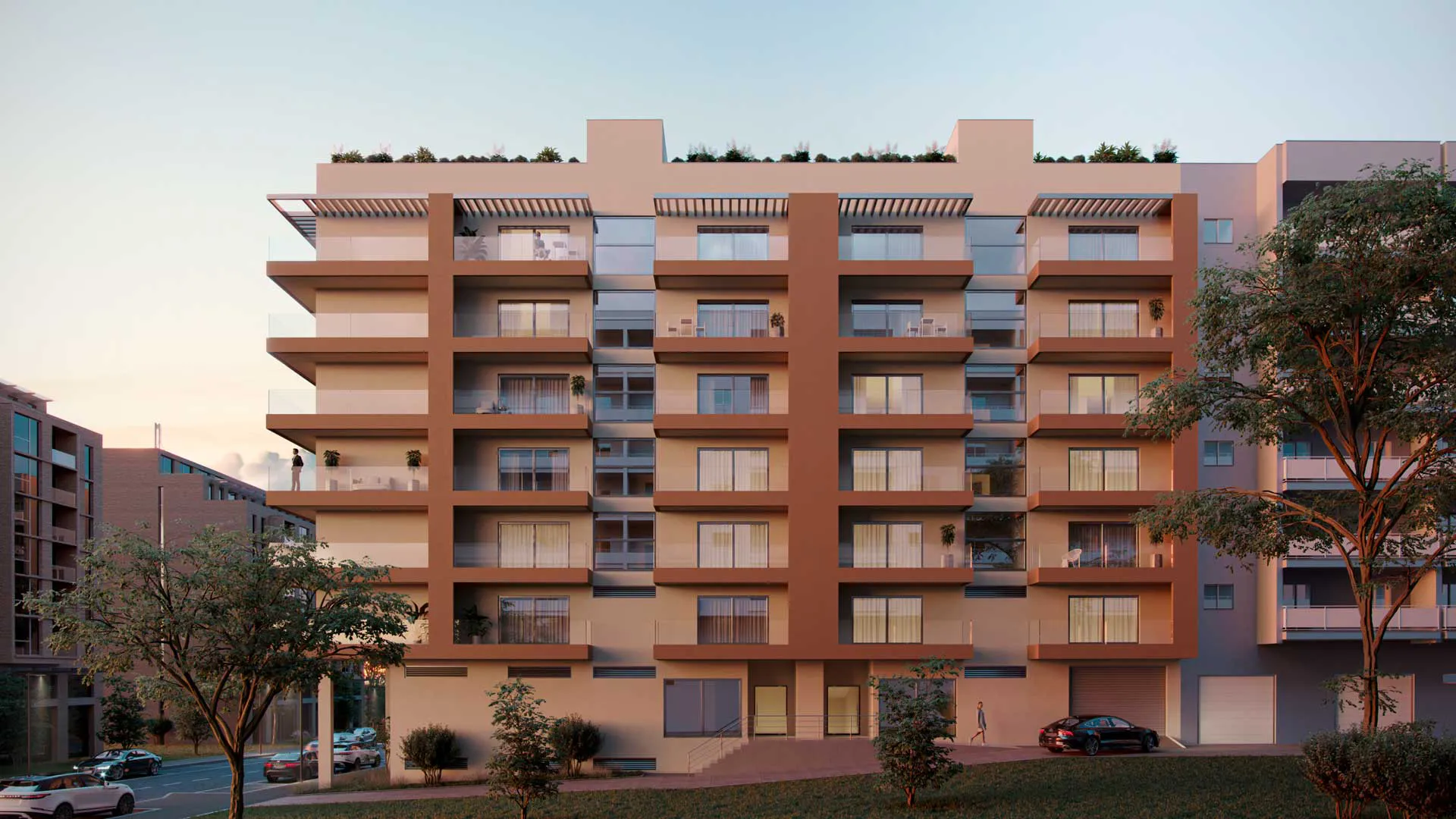
3D images of the interiors and exteriors
We developed the 3D renderings of the development, both for the interior spaces and the exterior surroundings, ensuring that all environments respected the materials, finishes, and language defined in the project. This work allowed for the visual translation of the architectural proposal and reinforced the perceived value of the development throughout all stages of its communication.
website
In parallel, the development’s website was also created, aligned with the brand’s entire visual universe and designed to clearly present the apartments, the location, and the project’s main attributes. Once the branding component was consolidated, it was necessary to expand the project into a more immersive and commercial dimension.
Welcome to our community!
Sign in or register.
Welcome to our community!
Sign in or register.