


PALCO is a creative studio specialising in creating experiences that tell impactful stories.
With an innovative and strategic approach, we help brands stand out, stay relevant, and build authentic connections with their audiences. Our space hosts a range of initiatives, including the Showcase for Brands, dedicated to activating emerging brands. We also run “É Pra Amanhã”, a feature that gives a voice to creative and inspiring people.
REBRANDING
Over the past few years, we have been working closely with Trimalhas on different communication projects. This journey has enabled us to closely follow the company’s evolution and understand the need to align its visual identity with the brand’s current positioning—increasingly focused on innovation, quality, and a close relationship with its partners.
The rebranding therefore stems from the desire to translate that evolution visually, maintaining the essence of Trimalhas while building a clearer, more contemporary, and more confident language.
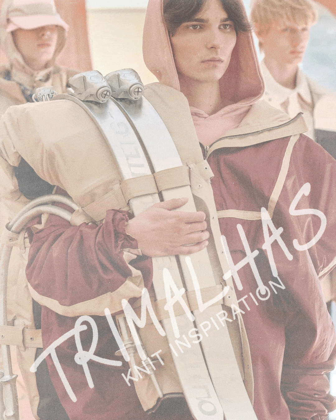
A LOGO WITH CONTINUITY AND CHARACTER
The new logo retains a feature that has always been part of Trimalhas’ identity: its handwritten expression. As in the previous version, the calligraphic gesture remains present, preserving the brand’s human and approachable dimension.
In this new approach, the typography appears in uppercase, reinforcing the identity’s presence and solidity. Interestingly, this decision was also inspired by a gesture that is very characteristic of the company: the way employees handwrite the name “Trimalhas” on the fabric rolls to identify them day to day. A simple detail, but one that is deeply connected to the brand’s reality, and which ultimately influenced the final logo design.
A SYMBOL INSPIRED BY THE BRAND’S PRODUCTION PROCESS
The new identity is accompanied by a geometric symbol that visually conveys the brand’s universe. Its construction combines the letter “T” with two loops that suggest an “m”, creating a direct reference to the name Trimalhas.
This shape is enclosed by an oval that evokes circular knit (the company’s main product) and the fluidity of its production process.
TYPOGRAPHY & COLOUR
The Work Sans typeface was chosen to complement the logo, bringing functionality and modernity to communication materials. Its clarity and versatility balance the brand’s calligraphic expressiveness with efficient readability in different contexts.
In terms of colour, the decision was made to keep blue as the main colour—an element deeply associated with Trimalhas’ history. However, the shade was subtly refined to reflect a more current, sophisticated brand aligned with its contemporary positioning.
Welcome to our community!
Sign in or register.
Welcome to our community!
Sign in or register.